

treat is a mobile app that allows pet owners quick access to reliable vets, in and outside of vet clinics' open hours. I conceptualized, researched, and designed the app as part of my 5-month, intensive UX Design program at CareerFoundry.
Project duration: August - December 2020
My role on the project: UX Designer and Researcher
Project collaborator: Slavyana Ivanova (Logo Design)
Tools used: Figma, Sketch, inVision, Balsamiq, Miro, Optimal Workshop, Usability Hub
Throughout the project, I followed the iterative design thinking process, that allowed me to make research-informed decisions and to 'flesh out' my design at every stage.

In order to Understand the problem space, I formulated a problem statement and conducted competitor analysis on existing products on the market. I also wrote user stories to help represent my hypotheses about the user and main functionalities of my app.


Competitor Analysis:


User Stories:


Next, I set off to Observe and understand the goals and needs of my target users by conducting 4 user interviews with pet owners.
User Interviews:


After having gathered rich insights from my research participants, I moved on to the POV phase and created my target user personas: Alice and Pablo. Personas are a great tool to visualize research findings and to 'put a face' next to a set of user goals and motivations.
Personas:


Once I had my research-informed, visual user personas in place, it was time to start the Ideation phase. In this step I created the User journey maps, User flows and Sitemap of my future app. My user journey maps visualize the processes Alice and Pablo go through, in order to accomplish their goals. The user flows help connect these processes to specific flows and actions users are performing on my app. Finally, the sitemap is a visual representation of the way information on my app is organized.
Journey Maps:


User Flows:


Sitemap:

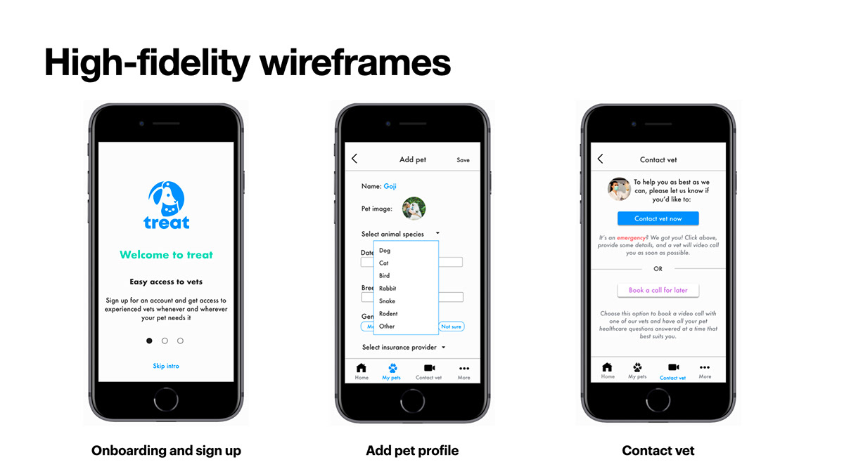
Next, it was time to move from concept to iteration. I started Prototyping my design solution, with pen and paper first, and after that increasing the design fidelity to mid- and then high-, using various wireframing and prototyping tools such as Balsamiq (mid-fidelity), Sketch and inVision, and then also Figma (high-fidelity prototype).


With a working high-fidelity prototype on my hands, I proceeded to Test it with real users, matching my app's target users profiles. The usability testing phase constituted a substantial stage of my app's design process, with careful selection of methodology, recruitment, consolidation of research data and analysis of the results.
Usability Test Plan
Goals: The usability study observed how well users understand the app ‘treat’, its value, and how to complete basic initial functions such as signing up, building their pets’ profile and contacting vet professionals.
Test objectives:
- Measure how well sign-up and onboarding for the app match the user expectations
- Measure how easy it is to ‘Add a pet profile’
- Measure how the ‘Contact vet’ function is performing in terms of clarity and ease
Methodology: Six 15-minute long, remote usability tests moderated, conducted and recorded via video conference software Zoom and Skype.
Recruitment: I used social media (slack and Facebook communities of pet owners) to recruit my participants.
Participants profiles:


The 6 completed tests meant that over 100 minutes of video recording and 6 pages of notes had to be coded, visualized and analyzed. I did that using the Affinity mapping and Rainbow spreadsheet methods.


I was pleased with the overall positive user feedback on my app. The data collected in the test sessions helped me prioritize the areas for improvement and iterate on the key errors/ issues (see examples below) discovered during users' task completion.


Another usability research exercise I ran - a Preference test of my app's splash screen - made me realize the logo I had initially designed is confusing to the majority of users and does not represent the app identity as good. I reached out to a professional graphic designer, Slavyana Ivanova, who gifted me the treat logo, inspired by the Gestalt principle of closure and featuring pets and the treat brand colous.

Next, I set off to polish the visual aspects of my designs and to create a design language for my app, consisting of a color scheme, typography and iconography, UI and other visual elements, as well as a language and tone of voice guidance.


Finally, I conducted a round of peer feedback with fellow UX designers who gave me much-appreciated comments and suggestions for improvement of the current design iteration.


treat's clickable prototype can be accessed here
Thanks for reading this far 🤓. I'm always happy to hear from the community, so do reach out and let me know your thoughts!

